Forever Tuned
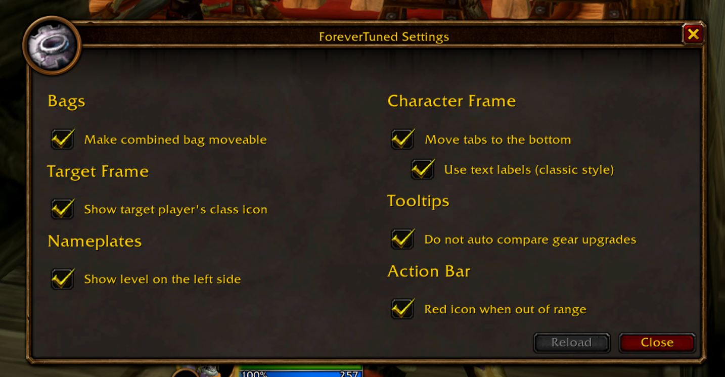
A handful of UI tweaks for World of Warcraft Forever that fix the small things that bugged me the most.
Why I made it
I’ve been playing World of Warcraft Forever, and while I love the feel of the new client, there were a bunch of tiny annoyances that kept pulling me out of the moment. Bags that wouldn’t stay where I put them. Tooltips popping comparison windows I never asked for. Information sitting on the wrong side of the screen.
None of these are dealbreakers on their own. But together they added up, so instead of complaining I did the obvious thing: I wrote an addon. It’s called Forever Tuned - a small, focused set of quality-of-life and aesthetic tweaks on top of the default UI. No full overhaul, no reinventing the interface. Just tuning.
Here’s a tour of what it does.
Bags that behave
This is the feature I missed the most. In Forever Tuned:
- The combined backpack can be moved freely, and it remembers its position between sessions.
- Opening any bag opens all of them.
- The reagent bag is anchored to the combined bag, so they travel together.
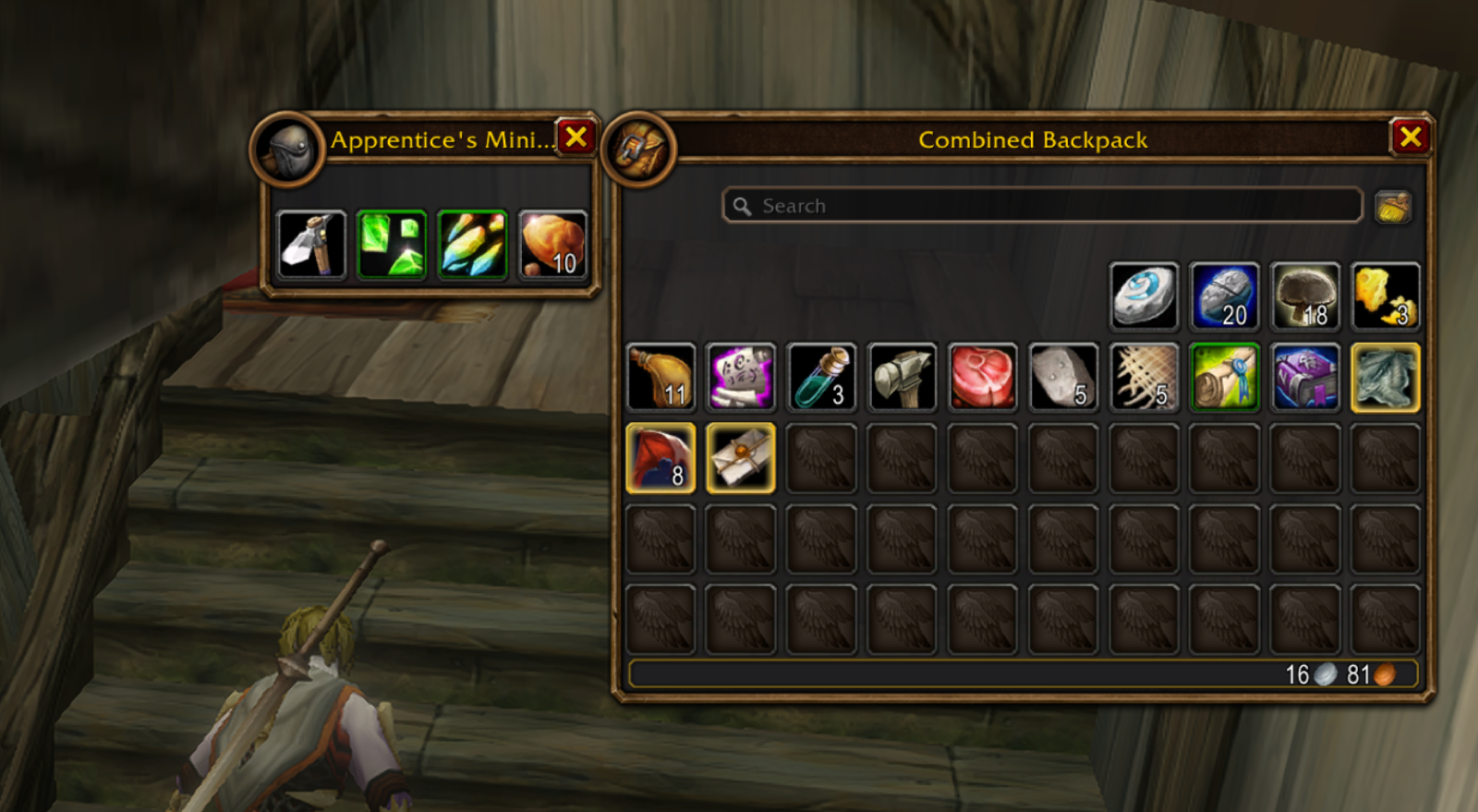
It sounds trivial, but having my bags open exactly where I left them every single time is the kind of thing you stop noticing - which is exactly the point. The reagent bag stays docked right next to the combined bag, so everything opens together in one tidy block.
The bank got the same treatment. It’s movable and remembers where you parked it, so you’re not dragging windows around every time you visit.
Character sheet, tuned
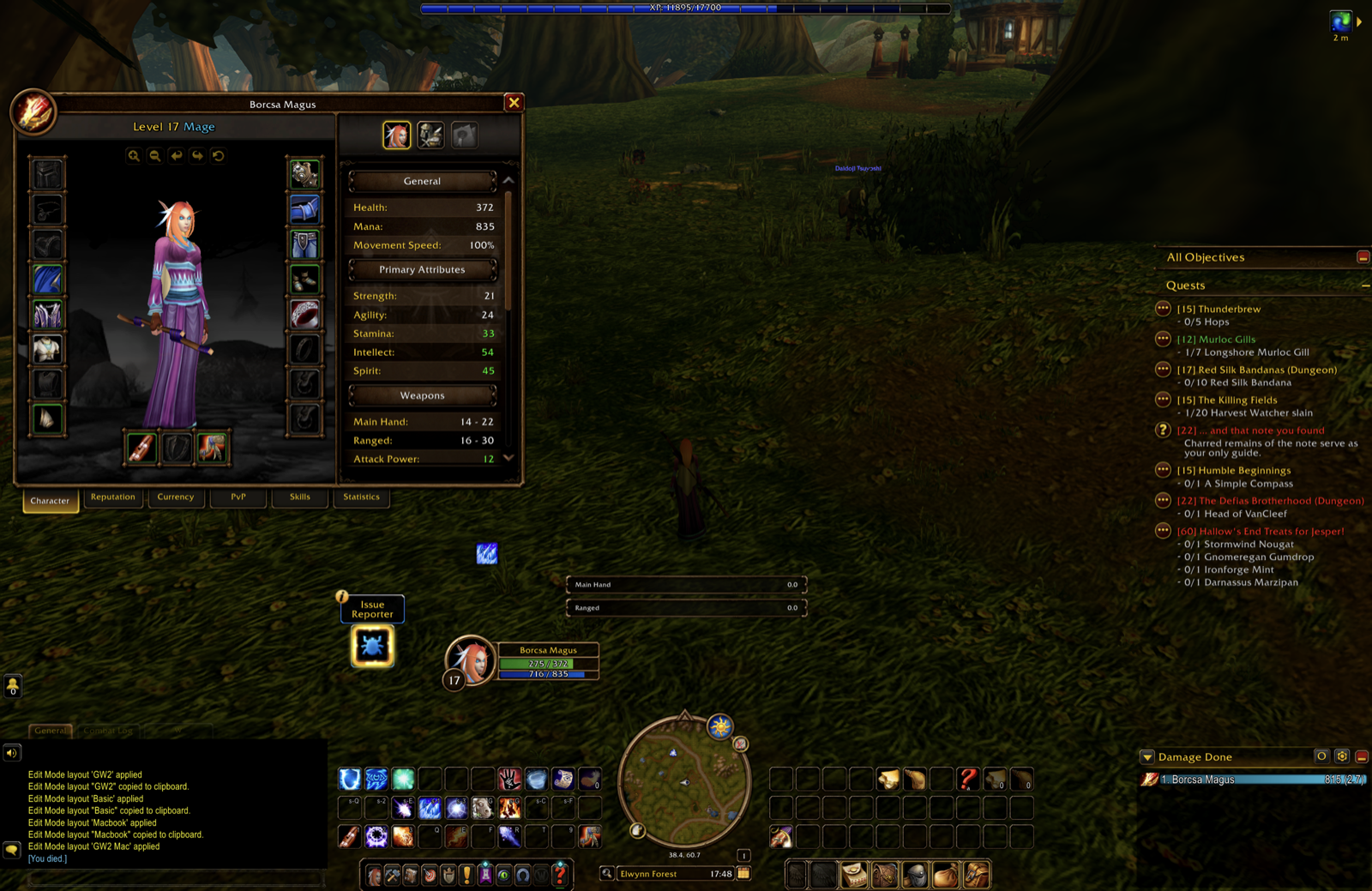
The default character panel has its tabs stacked down the right side of the pane. I moved them to the bottom - that’s where they sat in the original classic client, and it’s what I’m used to.
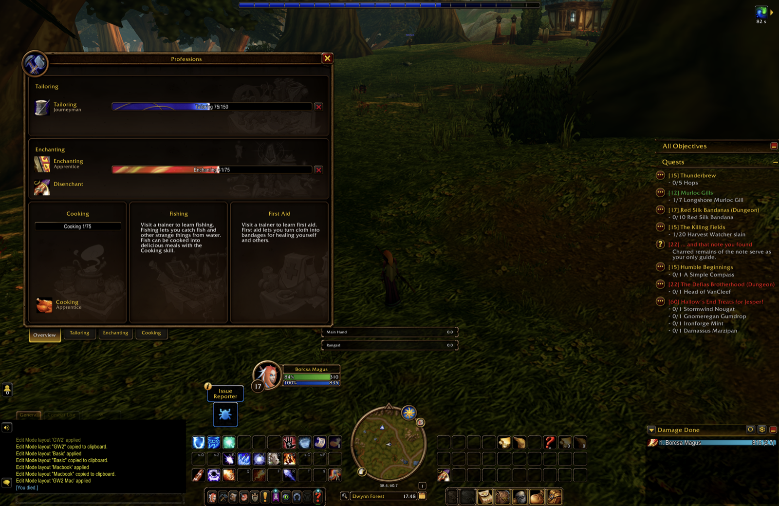
The professions window got the exact same treatment - tabs moved to the bottom, for keeping the same layout.
Combat readability
Two changes here, both about reading the fight faster:
- Nameplate level moved to the left of the health bar
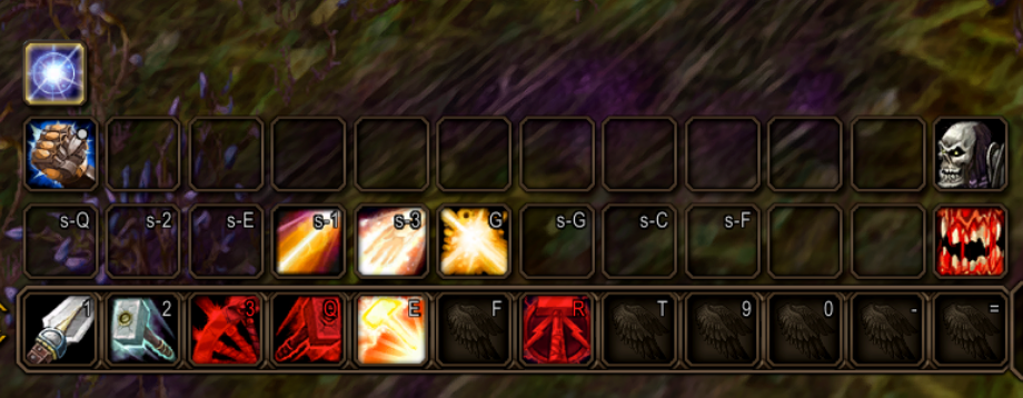
- Action bar icons turn red when the target is out of range
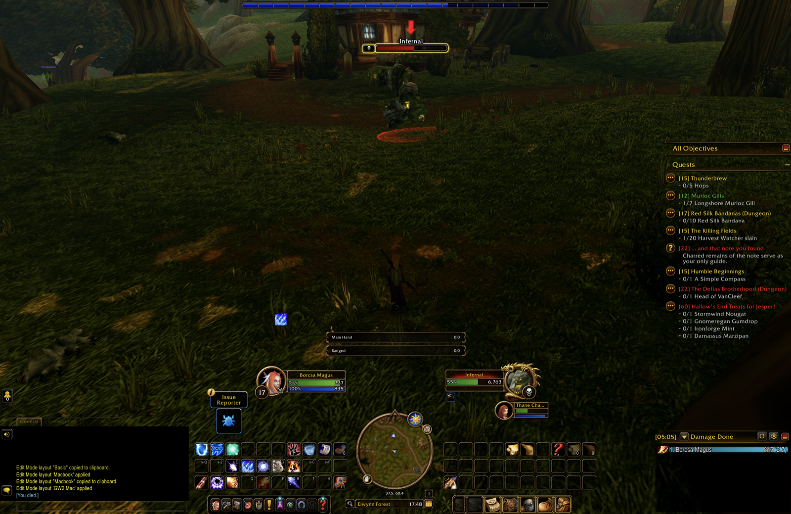
Up close you can see the range coloring at work - the red icons are the abilities I can’t use on my current target right now.
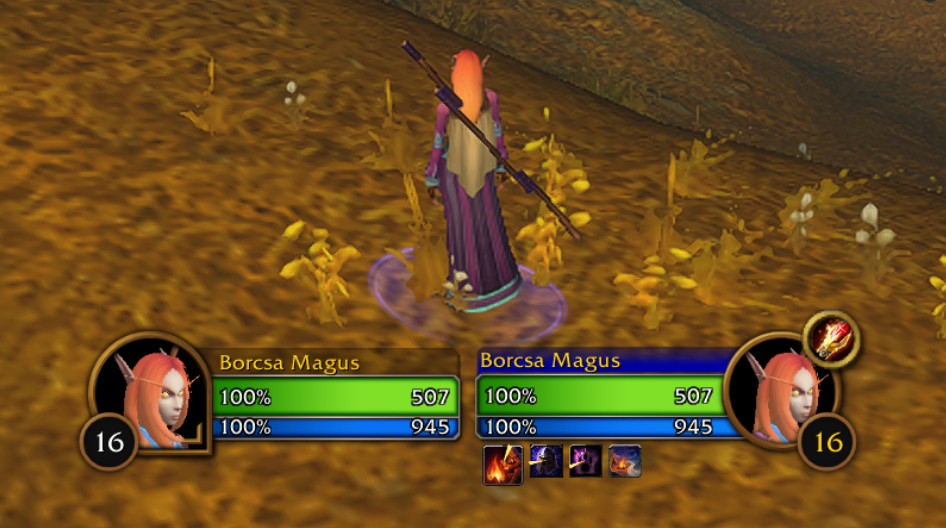
There’s also a small target-frame addition: a class icon sits above the target’s portrait, so I can tell at a glance what I’m up against (or grouped with).
The little things
Rounding it out are the tweaks that don’t need a screenshot but make every day smoother:
- Shift-to-compare - the auto gear-comparison tooltip only shows when you hold Shift, instead of cluttering every single hover.
Everything is toggleable through a settings panel, and all of it defaults to on because, well, that’s how I like to play.
Where to get it
Forever Tuned is open source and available on both platforms:
- CurseForge: Forever Tuned
- GitHub: Borcsa134/forever-tuned
It’s an ongoing project - the README ends with “More to come…” and I mean it. If there’s a small annoyance in the Forever UI that bugs you too, let me know, or open an issue on GitHub.